Walking Among Birds is a project intended for all those who share their passion for nature and especially for birds.
LOGO COMPOSITION
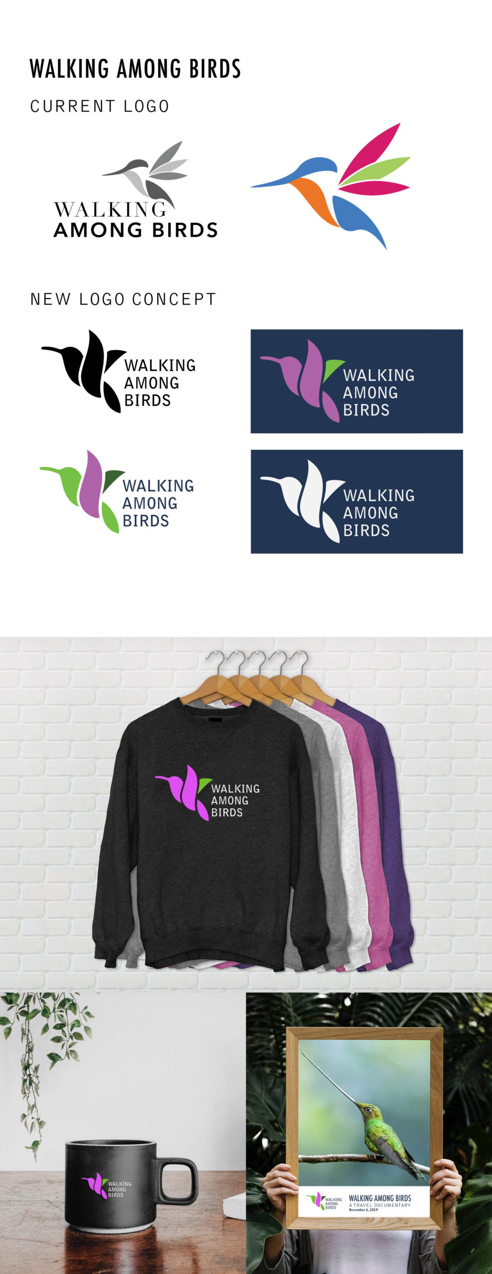
Based on competitive analysis, many brands that represent bird organizations have a bird symbol as part of their logo. The idea behind the new logo is to keep the original concept of a hummingbird but simplified.
The purpose of the new logo is to make the project more visually appealing and create a comprehensive, cohesive brand.
The logo will mainly be used as an icon for bird photography; thus, a prominent and easy to recognize symbol is imperative. While I want to create a strong mark for the project, I want to make sure the focus point is always photography. To accomplish this, I think the best option is to keep the logo simple and play with the positive and negative spaces.
The reason why I want to use an icon for the logo is that the project is in both English and Spanish. I want to make sure that the logo is recognizable in any language.
LOGO COLOR
The current logo uses too many colors, making it hard and expensive to print. The idea of the new mark is to have a simplified, less distracting design. The inspiration for the colors comes from the tones of Anna’s hummingbird. I chose this color palette because it uses complementary colors that create aesthetic harmony.